Business Line Reporting
Product Lines A project at Cisco
Overview- the problem
Business Line Executives work with a multitude of managers, ensuring product delivery remains on schedule and aligned with business goals. Managers create their own powerpoints or excel documents to collect and update the executives via email, document sharing or business meetings. Executives viewing these reports takes a lot of time as business requirements change, reporting styles change based off managers and executives are forced to learn and to adapt these different styles. Business does not want to invest in any new software & because each business line uses different tools a single tool needs to be selected and have managers trained/supported for migration.
Goals
- Create a reporting portal that has consistent visual heiarchy through each business line showing progress, KPI's, status and document reviews.
- Create a standard method for managers to upload their reports.
Constraints
- No formal data collection process in place
- Solution must be made using least amount of resources and budget
- Each Business Line manager uses different reporting layout & executives want a simple visual solution
- Transfering and accessing files is unpleasant to executives
Solving the Problem - The Process
- Research software & tools being used and what's available to stay within budget and ease of use for both users.
- Review each product line's reports & analyze for similarities to create standard template & Distribute to managers
- Making the Report Portal
- Product Name
- Product Type
- Start Date
- End Date
- Impacts & Gaps
- Product Lead
- SME
- Product Page
Research software & tools being used and what's available to stay within budget and ease of use for both users.
with the executives clearly stating no new tools will be purchased, a tool analysis must be made to see what is available along with what tools are already being used by the managers.
Review each product line's reports & analyze for similarities to create standard template & Distribute to managers
Each product lines report had the following headings
Deciding what platform to use
Managers were mostly using Microsoft products such as Excel and PowerPoint to build their reports, however, each manager organized their report in different styles and access had to be granted every time a new report was made for executives to have access.
With Microsoft products being used, the selection of tools became narrow, leaving PowerPoint, excel or another Microsoft product such as SharePoint to create a visual that is easy to access and friendlier than the other microsoft tools.
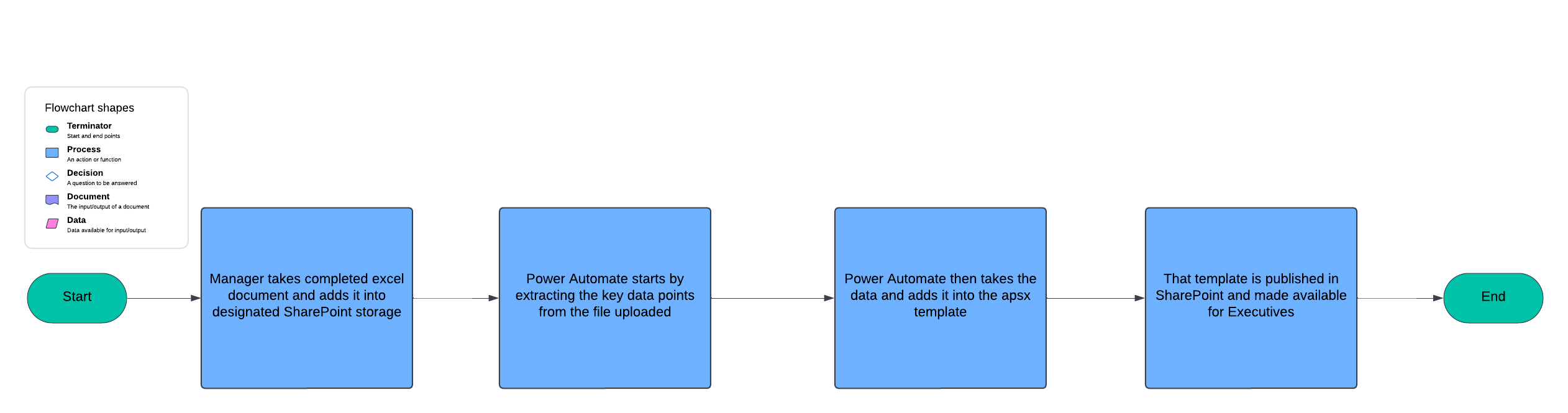
The question is - How do I get data out of an excel file and create a easy visual for executives? with limited resources?
The Answer - Using Power Automate I can extract/copy data from the excel and store it in SharePoint, and while using Power Automate generate custom .ASPX pages where I can customize the CSS and JavaScript to create a simple visual that will please the executives.


Now that I know what tools I am going to use to build the solution, I need to get a process map.
High Level
For those interested in the technical execution of this solution, stay tuned, I will post the link here when it is complete.
For the rest of this case study, the focus will be on the design of the product.
The Users
In this situation there are only two users, the executives reviewing the dashboard and its containing documents and then the managers who upload the data.
Managers
The Managers have the easiest perspective, so we will start there. Managers have to navigate to a pre-set storage location in SharePoint and upload their excel file.
There is no new concepts for managers at this point as SharePoint is familiar and used across the organization. Managers then will check the dashboard to ensure their data is populated properly.
As long as the managers use the template properly, then no errors would be found.
Managers in this case are secondary users, not high importance in regards to design.
"To quickly navigate to the data, without confusion or missing information"
-Executive
Executives
Here we are dealing with users who need less time spent understanding an interface and to quickly get the information they need to make infomred business decisions. Because of this desinging as simple as possible will be key.
Questions that were considered for this group was:
1)What data charts are they used to reviewing, layout,color coordination, chart types
2)Would they need to download the data
3)Do the executives need to give access to anyone?
Collecting this information was fairly easy as I had access to the executives for interviewing.
Content Structure
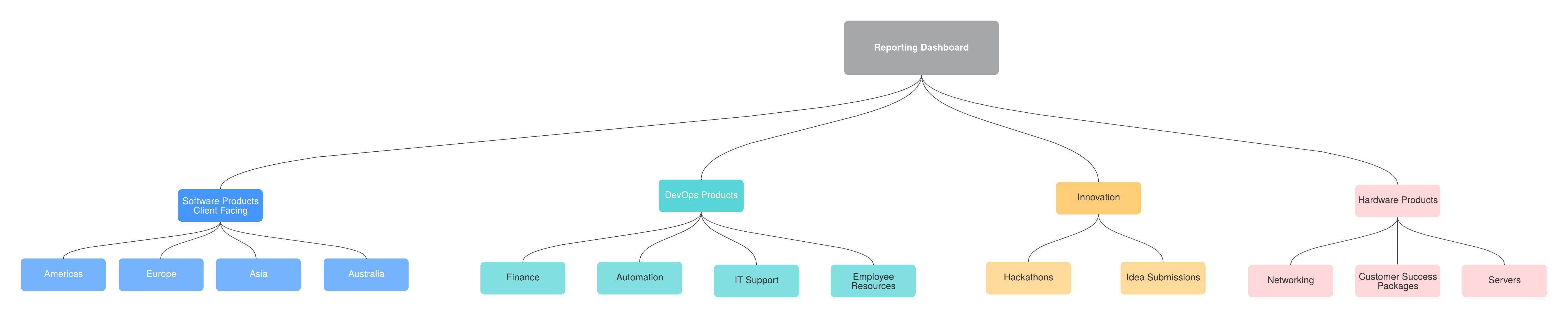
low-fi Mockup
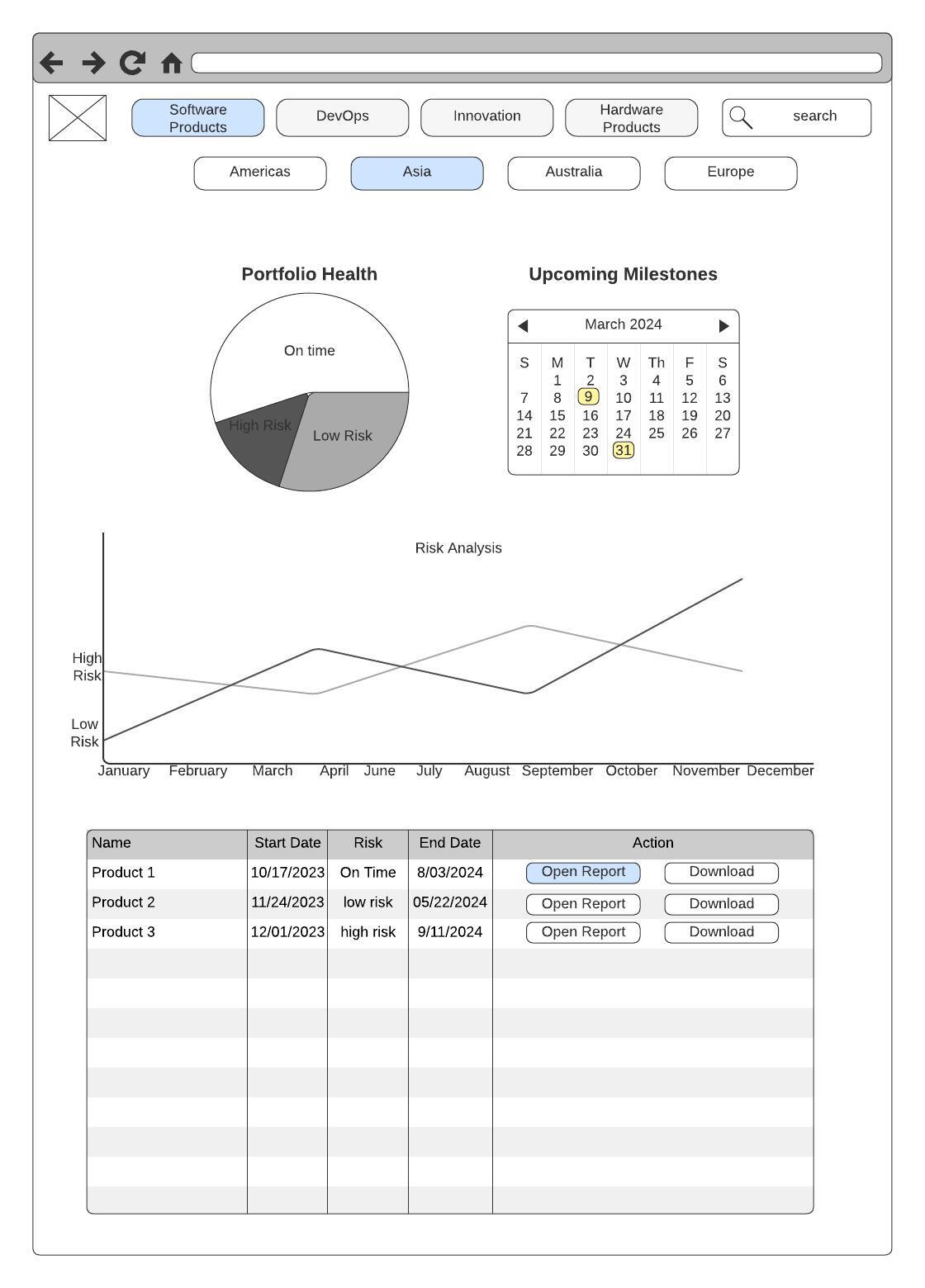
One major benefit of building these platform using custom apjx pages, is that we are able to avoid the standard SharePoint layout allowing to use SharePoint more of a host than a tool itself.
Screen 1
In Screen 1 the Executive selects Software Products and then the second level menu dispalys geolocation options and Asia is Selected. Then the executive selects the product they want to review by clicking Open Report.
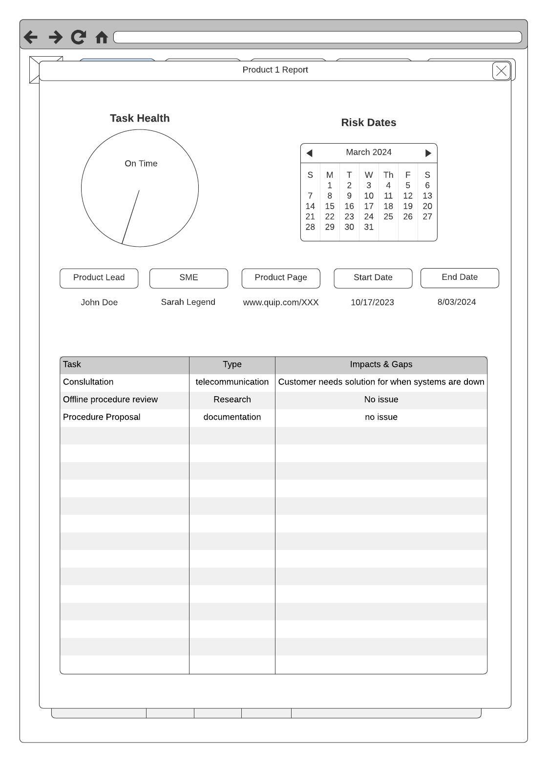
Screen 2
Upon clicking Open Report a modal is dsiplaying the product report on the more detailed level giving executives access to Tasks being working on, any impacts on the rise and who to contact for concerns.
Conclusion
Executives now have a place to view their reports in a standard format, reducing the strain of seeing different formating across different product lines. Managers gained a single template and location to upload their data and no longer needed to make presentations for their reports saving them
time for other important tasks.
Constructing a solution that is intuitive on low budget can be tricky, but knowing how to use the tools already in possession can unlock opportunities to solve business problems that typically require multiple developers and designers to complete that can now be done with a single person.